HANS HOFMANN
In the realm of high-modern abstract painting, the color purple rarely gets the spotlight. The hue doesn't have its own Picasso phase, like rose or blue. And let's face it: Jackson Pollock's "Lavender Mist" is light on the lavender and heavy on the black and white. So it's exciting to watch Hans Hofmann play with purple and give it center stage in a pair of works on view right now at Ameringer | McEnery | Yohe.
This show is a rare chance to see several Hofmanns in one room in New York. Like purple, the artist could use more exploration. There hasn't been a Hofmann museum exhibition in New York since the Metropolitan's 1999 show. The last major New York retrospective was at the Whitney in 1990. In 2012, the Museum of Modern Art made news headlines when it decided to deaccession a Hofmann painting.
This lack of attention is strange, given how insanely influential the artist was to several generations of painters. Who else could have said he was friends with and artistically admired by both Pablo Picasso and Jackson Pollock? Karen Wilkin and Geoffrey Dorfman even organized an exhibition about Hofmann's outsize influence at New York's Painting Center in 2005. It's a loss, that he doesn't get more institutional love. What Hofmann does with color is lavish.
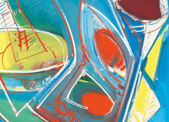
At Ameringer | McEnery | Yohe, the artist's "Seated Woman" (1944) is this shows pièce de résistance. It barely resembles a woman, but part of the fun is trying to find her form in there. Her core is purple, with shades of lavender, thistle, light mauve, deep plum, heliotrope, and even hints of byzantium circling around it. Get excited if you don't recognize these color words - Hofmann's road to the rainbow is the less traveled.
The hues shine like amethysts because Hofmann carefully wraps shapes, lines, and colors around the violet core. The yellow background and patches floating nearby crank up the purple's chromatic intensity. The two are considered "complementary colors," but their relationship isn't amicable - it's about tension, back-and-forth, and a magnetic visual chemistry. But Hofmann is careful not to overdo the effect. Patches of black, white and gray seperate them. The distance seems to pull them towards each other.
Hofmann was fond of using the term "push and pull" to describe what makes painting good. For him, abstraction was about elements that pull at and push up against one another, creating energized forms that flicker and convey motion. But the trick was to get the parts to come together just right. As Hofmann once remarked, "Colors must fit together as pieces in a puzzle or cogs in a wheel." It's easier said than done (and PBS has a game that reveals how hard it is).
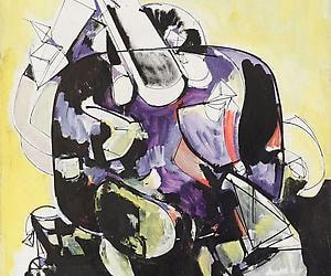
Fury No. 1" oozes radiant orchid, which Pantone has named the color of 2014. The misty lower left quadrant may appear empty, but in reality, it explores countless shades and valuations of orchid. The black, white, and yellow in the rest of the composition all do their part to chromatically compliment the background, making the depicted petroglyph beast appear to glow with rage.
I think it pisses God off if you walk by the color purple in a field somewhere and don't notice it," remarks Shug in Alice Walker's novel The Color Purple (1982). Why we don't see purple more in the fields, whether pastoral or painterly, is a dissertation waiting to happen.