Monique van Genderen
The paintings of Monique van Genderen are something to move into: spaces defined by shape, color, depth, and motion. Van Genderen, a self-described nonobjective abstractionist, is hard to pin down to a particular genre or art movement, although her work touches on quite a few — including Abstract Expressionism, color-field painting, and Abstract Illusionism — while remaining in a class by itself. “I am working with a lot of elements of illusion, specifically conceptual illusions, playing with people’s expectations of what they’re looking at,” she told Pasatiempo. “Sometimes I landed in the color-field genre because I was making more reduced paintings with shapes I collaged together. But I’m really attempting to make every painting pretty different.” With notable, well-received exhibits on both coasts under her belt, van Genderen, a Los Angeles-based artist, comes to Santa Fe for her inaugural show at TAI Modern.
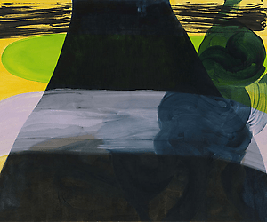
Large-scale vertical paintings not included in the exhibit contain elements that can hint at the figure. Their 6-by-4-foot configurations suggest the dimensions of the human body, although there is nothing specifically drawn from life in her works. “When the viewer’s looking at them, they have this relationship to them, almost like a person. But the composition is abstract imagery.”
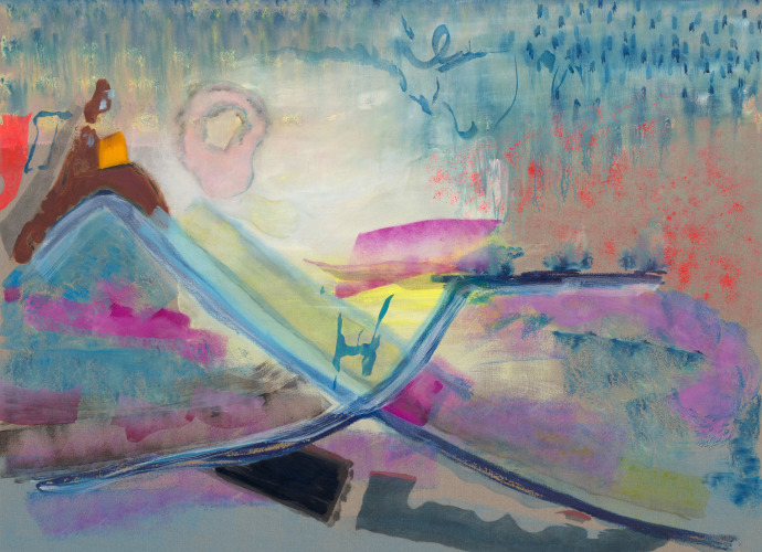
Prior to her vertical paintings, van Genderen worked on horizontal canvases, a format she returned to for the new group of pieces at TAI Modern. Her paintings can’t exactly be described as reductivist because, although the shapes and forms are uncomplicated, they are not drawn from life and therefore not related to something specific in the real world. Van Genderen doesn’t take a form and abstract it; her canvases are abstract from beginning to end. Even the elements reminiscent of landscapes seem so more by chance — or because of associations a viewer brings to a piece — than by intent. “I disbanded with the horizontal because every time I looked at [those works], they read too much as landscapes. I think a lot of abstract painters have gone to the vertical because of that. I have been thinking of them as relating to landscape, but they’re not representations of landscapes.”
Van Genderen’s works encapsulate a dichotomy of spontaneity and control. Her compositions balance solidity, often marked by rich color saturation, and atmosphere, accomplished by thin washes of color that convey an openness into which shapes recede and from which they emerge. Even at their most gestural and dynamic, her paintings are self-contained, giving the appearance, or illusion if you will, of action that’s been rendered with precision — almost as with hard-edge painting.
The artist has worked with collaged elements in the past, using cut vinyl in painterly arrangements. “The vinyl material is from the sign industry. [It was] designed to be a paint replacement, like a sheet of color a mechanical apparatus could cut out and affix to the wall with adhesive. I recouped that material and made paintings out of [it]. I was going at it with a very expressionistic palette-to-canvas method of working — although [I was using] a knife and not a brush — and layering transparent materials to create other colors. That may have landed my work in the color-field or hard-edge abstract painting class, because the edges were cut.”
Van Genderen also uses contrasting color and brushwork techniques to belie her compositions’ apparent simplicity. One untitled vertical from 2013, for instance, is a wedge form encapsulated by concentric rectangles of gray, orange, magenta, and black. The central shape — the wedge — combines the magenta and orange to create a visual cohesiveness between the inner and outer elements of the work. It feels like an impromptu painting style, and perhaps it is, but one made with an inherent sense of the relationships between color, line, and form. Rigid shapes enter the canvas, often from along one edge, with a closeness that suggests they’re in the foreground of the painting. Linear elements and large swaths of color are made with less precision and looser brushwork reminiscent of calligraphy. Planes of color overlap like translucent veils, creating different color dynamics where they intersect. The palette is varied, and the artist often juxtaposes or layers bright yellows, light greens, and blues with more somber earth tones and inky blacks.
In addition to the canvases, the exhibit features a selection of her ceramic pieces made with the same painterly sensibility — only van Genderen has replaced paint with ceramic glaze. “Those heavily relate to the vertical paintings. After making 50 pieces in that vertical format, I felt I knew it too well, so going to ceramics was a great way to paint dumb and blind again. It’s in keeping with my mini-history of dealing with materials and forcing them into a position of being an actor in the installation. I put the ceramic paintings within the installation of my work, and people think that they are canvases at first glance. This is what I was talking about when I said I play with conceptual illusions.”