Beverly Fishman

Installation view of Love Letter to L.A., 2021, GAVLAK Los Angeles
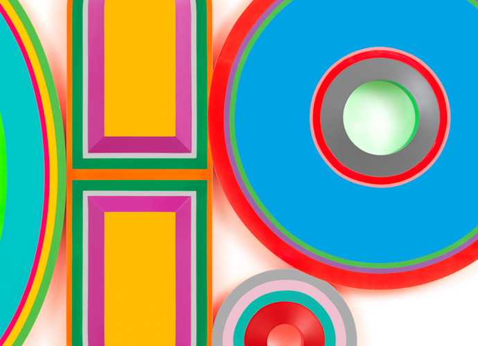
In 1914, an American surgeon named Harry Sherman used color theory to determine that "spinach green" should be the new color for hospitals, as he believed that this color better complemented the blood red of sheets and white walls that were common at that time. Sherman went on to create an all-green environment - including lighting, walls, floors, sheets, and medical devices - and the color quickly spread to other hospitals. Green is still used today in medical settings, perhaps because the initial idea that it promotes a sense of calm has remained strong. Big Pharma has gone further, recognizing the effect of color on the psyche and manipulating the color spectrum to increase the mental connections between the consumer and the drug. In his latest exhibition, Love Letter to L.A., artist Beverly Fishman used green (among other carefully selected hues) for a similar purpose, continuing her ongoing exploration of the abstract nature of pain and well-being. The exhibition analyzed and reappropriated Big Pharma's claim to our individual and nuanced experiences, using them to market their products to us, an increasingly medicated consumer public. Fishman's new paintings on molded panels maintain a provocative line of inquiry into the seductive, but ultimately destructive, control that pharmaceutical conglomerates exert over the public.
With titles like Untitled (Epilepsy, Pain, Chronic Pain, Opiate Dependence) and Untitled (Pain, Asthma, Anxiety) (both works from 2021), Fishman's paintings look like geometric arrangements of pills and capsules, like prescription cocktails for the ailments indicated in parentheses in the title of each work. Most of us have synaesthetic responses to color - emotions that arise when we see certain shades - and pharmaceutical companies take these associations into account when developing their products. Medicines for children are usually pink because this color suggests something sweet. Yellow connotes playfulness or the bright taste of a lemon. Blue is calming, green reduces anxiety, and orange inspires a spirit of optimism. Drawing on this knowledge, Fishman uses a general palette of dusty pinks, soft lilacs, cool blues, and pale sands, mixed with the occasional clash of lime green, nuclear yellow, and traffic cone orange. In Untitled (Insomnia, Pain, ADHD, Pain) (2020), the centers of the different shapes - a rectangle with two rounded corners, two ovals, and a semicircle - are hollow, revealing the white wall of the gallery behind. Its contours, with a gloss effect, are outlined with striking tones that enhance luminosity. The more energetic hues seem to represent the momentum and vigor of the initial, soothing effect of a pill that achieves its intended physical or mental relief. The mauve and mauve hues evoke the inevitable withdrawal and the most sinister side effects of medications.
Fishman plays with the historical strategies of art, reimagining the seduction and control of the Finish Fetish and Light and Space movements to approximate how the pharmaceutical industry first attracts and then betrays those in the throes of dependency on its drugs The simple, bright shapes are inspired by Californian minimalist artists like Craig Kauffman, with his pill-shaped plastics and hard-edged abstractions. The mix of satin and matte finishes in the works results in a deceptive dimensionality, blurring the concavity of each painting. Each pill is a new optical illusion, another nod to Big Pharma's false promises and hoaxes. Fishman infuses his luscious, lustrous works with the hidden implication of a seedy background that hides under the striking facade of pharmaceutical culture. The glowing, yet minimal nature of the exhibit reflects the promise of Western medicine. Both emanate pristine hope, but when you read the fine print - or, in this case, the press release - neither inspires optimism.
For every dollar that pharmaceutical companies spend on research and development of a new drug, they spend $19 on its advertising. At scale, the estimated median capitalized R&D cost per product was $985 million between 2009 and 2018. With 40 to 50 new drugs approved each year, that's more than $6 billion annually in advertising alone. According to the press release, the roses of works such as Untitled (Pain, Anxiety, Anxiety) (2020) refer to the unfortunate reality that women are “particularly vulnerable to campaigns pharmaceutical companies that classify their targets by gender, even when doctors misdiagnose them” - the clichéd color choice points to the rampant sexism occurring in Western medicine, which often leads to women's pain being misdiagnosed, or not diagnosed at all. Many of the works in the exhibition include the word "anxiety" in the title, a diagnosis for which doctors often overprescribe drugs (given the countless anxiolytics on the market) while not venturing into the more tumultuous waters to address any underlying conditions. If anxiety is the constant resource of doctors to prescribe the pills in their arsenal, color is the reliable equivalent that Big Pharma uses to replenish that source. Color-coding simplifies brand marketing ("blue pill" is a familiar euphemism), helps elderly patients avoid accidental overdose, and aesthetically sells a mood, but hasty assignment of a color to an unpretentious consumer could have adverse effects. With more than 80,000 color combinations available on the market today, there is plenty of room for the careless spread of seductive and decorative packaging - like the bright pink Lite Brite-style aura that glows around the perimeter of the 'pills', otherwise nondescript, from Untitled (Anxiety, Three Missing Doses) (2020) - which doesn't spend much time explaining what these vibrant capsules really do once they go down the gullet.
The perniciousness of the pharmaceutical industry to which the exhibit refers contrasts with the general feeling of lightness and minimalism of Fishman's candy-coated constructions. The surprise comes when the sugary fog drastically fades, as if it were coming down from a high. Fishman intentionally manipulates our senses, revealing the luminous siren song of Big Pharma, and then plays on the end of our nerves. Love Letter to L.A. unearthed the physical and mental whiplash that prescription drugs inflict on a growing population of dependent users and a vast trail of misdiagnosed women who pay too much money to fill the wrong prescriptions.
— Neyat Yohannes
Translated from Spanish.