George McNeil
TRANS/FIGURE/ATION
Review in: The Boston Globe, 23 February 2011
George McNeil was not among the most well known abstract expressionist painters, but he was in the thick of it in the 1940s and 1950s, showing his brash, bright, gushing abstractions alongside work by de Kooning and Pollock. In the late 1950s, as the movement sputtered out, McNeil began incorporating the figure into his paintings. “TRANS/FIGURE/ATION’’ at ACME Fine Art traces McNeil’s evolution as a figure painter through the 1960s and into the early 1970s.
McNeil, who died in 1995, cannily applied all that he knew about abstraction to figuration. He used the human form as a dynamic aspect within a larger abstraction. Even when the figure is at the center of one of his canvases, it’s in active conversation with the other elements wheeling about it.
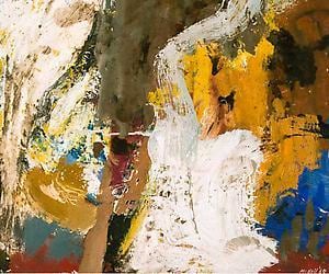
The earlier pieces are the most tentative. “Bosra,’’ a small 1960 painting, features a milky brown bulb with heavy white brushstrokes circling it, suggesting a hooded figure, but at the right dabs and lines of sharp brown and orange carry the heat of the composition, setting up a tension between shape and color.
Soon enough, the body became more explicit. “Rhoda,’’ a 1966 painting, looks down upon a seated nude, but she seems less a nude than a series of taut zigzags — protrusions of arms and thighs surrounding a blue Marge Simpson ’do hovering over the two red arcs of her breasts. The background, mostly steamy orange with a poison-yellow quadrant in front, commands as much attention as the figure and is equally keyed up.
That edgy interplay of figure and ground is intrinsic in McNeil’s vibrant, declarative canvases. “Bather #4’’ (1968) features a mustard-orange avalanche from the upper left suggesting a swimmer. Limbs scissor at the center. Brilliant green, red, and orange form a patchwork around the figure, and there’s a purple triangle in the distance, perhaps a wave peaking, throwing spray against and orange sky.
While the figure is unmistakable, it isn’t entirely readable, yet it is an integral element of the entire composition. McNeil played similar tricks with space — is that purple wave in the distance or right on the surface? Bringing figuration into abstraction, he could flirt with the viewer’s expectations and defy them at the same time. For this viewer, that’s spine-tingling.
Precision and humor
For some of the more obsessive artists, the work is all about technique and repetition. Repeat the same mark thousands of times, and those marks accrete into a work of art. You can see it in the two 2010 pieces in Jane Masters’s “Playing With Fire’’ at Miller Block Gallery. In “Starving Artist,’’ she took a heated wire and meticulously burned dots through both sides of heavy paper, making an almost three-dimensional drawing, which looks like a 19th-century girl’s needlework project with text — here, the piece’s title. It’s a stunning work of precision with a wry sense of humor.
But the 2011 works are sloppier, in a delicious way, and edgier. For these, Masters crafted branding irons, heated them in a furnace, and repeatedly branded water-soaked paper. “Playing with Fire (triptych 1),’’ on three sheets of paper, features eight columns of circles slithering down the length of the piece like stretched-out Slinkies. At the papers’ edges, the circles are muddier. That’s where she used a hotter iron, toying with combustion.
I especially liked pieces so built up with brawny lines that you can’t make out the shape of the brand, such as “Playing with Fire (4 part),’’ on a grid of four sheets. The loopy lines converge in cluttered patterns that retain the tenacity of the iron, so the drawing looks like a brown tangle of metal. In this one, Masters leaves empty spaces, breathing room from the hot, energized snarl. While seemingly less precise, this year’s drawings push the stakes higher, as the artist pushes toward losing control.
Beauty is in the eye . . .
The artistic partners Alexi Antoniadis and Nico Stone specialize in honoring the abandoned parts of urban environments. They’re also clever trompe l’oeil sculptors. You can see both elements in their thoughtful and surprising show at Boston University’s Sherman Gallery. The pair’s sculptures look like broken off edges of the ugliest public structures, now dilapidated.
Look at “Sob Story,’’ a more than 5-foot tall rectangular chunk that appears carved straight out of a drainage system. It’s a rectangle with two eye-like holes, each containing a length of pipe. On either side, muddy stains from the pipes pour like tears. A stick runs through one, impaling that eye. Antoniadis and Stone elegantly crafted this ugly thing out of plaster, plastic, and particleboard. Most of us would willfully ignore such a scene if we walked past it on the street. These two venerate it by making it into art that lends the ugly drainage ditch a human pathos.
The two also salvage and employ some throwaways, such as several large museum frames. They drew over the Plexiglas surface of each with lighter carbon — gorgeous, mottled brown patterns that look vaguely topographical and cast shadows on the wall behind. I thought of the buildup of cigarette smoke on paintings. Antoniadis and Stone stir tenderness for the untended.