Jim Isermann

Installation view of Flowers, 1986, showing Isermann-designed chairs, table and light fixtures surrounded by the artist’s paintings (enamel on wood, each 48 inches square); at the Kuhlenschmidt/Simon Gallery, Los Angeles. Photo by Tony Cuñha.
(1) In a public-art project for the Metro Blue Line’s Fifth Street Station in Long Beach titled Failed Ideals (1995, not represented at INOVA), Isermann had an opportunity to use glass in a way that relates to its tradition as a commemorative, historically referenced, public medium. For six 3 ½-foot circular glass disks installed on platform pylons, he designed patterns that are adaptations of decorative motifs from a bygone Long Beach drive-in movie marquee, diner floor, bank sign and amusement park funhouse. By reincarnating these local design fragments in glass, lsermann historicizes ornament that was undoubtedly taken for granted or ignored.
(2) For a site-specific installation (1993) at Le Corbusier’s Unite d’Habitation in Firminy-Vert, France, Isermann experimented with the allover application of a single, wild· ly busy design. lie covered a duplex’s entire interior-including its curtains and floor-with fabric and linoleum that featured a complex pinwheel-burst pattern of red, yellow, orange, green and blue. The last of lscrmann’s 10 pieced-fabric works (not at !NOVA) used leftovers of the Firminy fabric so that, as the artist describes it in Pagel’s helpful catalogue essay, “the patterns were made up of almost incomprehensibly complex arrays of fractured squares, pinwheels, and crescents. The next logical step was to actually weave the fabric myself.” (See David Pagel, “Home Improvements,” Fifteen: Jim Isermann Survey, University of WisconsinMilwaukee, Institute of Visual Arts, 1998, n.p.)
Michael Duncan —

For the past 15 years, the L.A. artist Jim Isermann has mined the unsettled relationship of abstraction and design, blithely mixing elements of “high” and “low” styles, At once referencing Arp and Marimekko, Albers and Ikea, Isermann’s eye popping paintings and patterned sculptures flirt with functionality, embodying abstract modernism’s quick evolution into the principles of design. Employing typically “low” forms of domestic craft—furniture, rugs, weavings, quilts, stained glass—his works further propose to track the geometries of hard-edged and Minimalist abstraction back to sources in the pattern-producing processes such as weaving and braiding.
A beautifully installed, full-scale traveling retrospective of Iseermann’s work, curated by David Pagel for the Institute of Visual Arts (INOVA), University of Wisconsin-Milwaukee, presents the gorgeous products of this one-man design lab. Learning the various crafts from his home hobbyist manuals, Isermann makes his works over countless hours with no studio assistants. The works’ flawless detailing helps direct attention to the formal properties of their making. For example, the plaid designs of the hand-loomed pieces are elaborations of the over-and-under patterning inherent in weaving. The loom is used as a device for making a complex pattern, one whose fine-line juxtapositions of color would be impossible to achieve in painting.
Isermann’s first works played off the late ‘60s flower-power furniture and kitsch decorations which he began to collect from thrift stores while a graduate student at Cal Arts. He became fascinated with how those biomorphic, space-age designs were stylistic knockoffs of both early modernist artists such as Calder and Noguchi and high modern designers such as George Nelson and Ray Eames. Isermann’s installation of furniture and wall decorations, Look Forward to Tomorrow (1983), pays homage to all these sources, bastardized and otherwise, using bright enamels and colored nylon chair webbing to create stark color contrasts and simple patterns. A starting place for Isermann’s enterprise, the colorful chairs, credenza and wall plaques play off Minimalist, pattern and monochrome painting; at the same time they function as potential prototypes for mass-marketing (no industry takers yet). A set of fake-fur-covered chairs and accompanying daisy-shaped sconces (1984) represent Isermann’s unlikely meddling of geometric minimalism and kitsch decor. Composed of a lozenge seat, an oval backrest and circular pillow, the chairs have a geometric purity that belies their absurd shaggy coverings and deranged decorator colors. Flaunting their ersatz heritage with comic insouciance, they claim kitsch design as a legitimate source for formal ingenuity.
For Flowers (1986), his first installation conceived with a gallery space in mind, Isermann made a flower-shaped table, its “petals” separated by five nylon-webbed seats, accompanied by 30 hard-edged, enamel flower paintings, some of which were equipped with painted-glass lighting fixtures and hung from the ceiling. Eight of the paintings were installed around the seating ensemble at INOVA. With chairbacks angled for easy upward viewing, the configuration serves as a kind of circular “pew” designed for individual contemplation of the graphic, vividly contrasting flower-patterns. Approximately, four skewed, parallelogram-shaped canvases were hung so that the negative space between them formed an ankh, the curved criss which is a symbol for life. At this altar to the utopian, color-satruated world of Warhol’s flower paintings, “Vote for McCarthy” stick-ons, and Herbie the Love Bug, Isermann invites a trippy, giddy, nearly religious embrace of decoration.
In his next environment, Futura (1987) originally designed as a video viewing room at the Los Angeles County Museum of Art, the patterning of Isermann’s thronelike seats and their accompanying paintings is more complex. Their colored cushions contrasting with trapezoidal backs and seats, the chairs he fashioned—two of which were exhibited at INOVA—are stark geometries in the spirit of the hard-edged painting by Paul Feeley or Karl Benjamin. The related, seven-sided paintings use concentric ovals to transform the eye-shaped CVS logo into a tantric talisman, one appropriate for video based reverie.
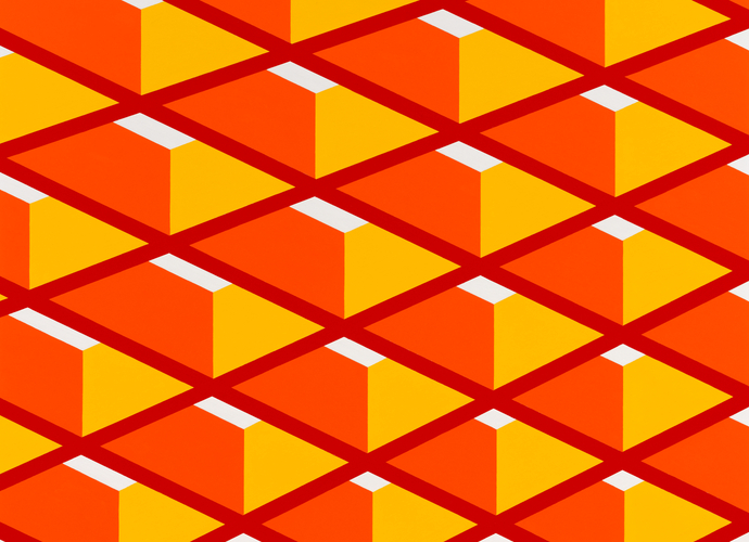
In the “hole paintings’’ (24 untitled works from 1987-88, each a 4-foot square made of 2-inch-thick plywood and with a shape excised from its center) and related mobiles, Isermann’s patterning approaches the complexity of Op designs by Vasarely. One hole painting, for example, features a tilted square cut out from its center. Seeming to fan out from the central square are additional, concentric, tilted squares, alternately painted in cornflower blue and red-and-white stripes. Isermann aligns all the stripes in parallel rows so that the intervening blue squares are perceived as negative space. Like the best Op paintings, the work is a mind-bending koan prompting a more complicated view of reality. With its mathematic precision, such a complex patterning achieves a kind of philosophical purity, one that also embraces paradox.
Isermann’s breakthrough came with a group of untitled works known as “Shag Ptgs’’ (1988-90). Marking a shift away from design issues per se, they literalize the bipolar nature of his enterprise. With their complex patterning precisely bisected, the works are half enamel paintings and half hand-hooked shag rugs. The confrontational relationship of the mediums sets up an odd dialectic, a forced marriage which both elevates a lowly hobbyist’s craft and humbles the high-hat discourse of abstract art. At INOVA, an 8-foot-square, diagonally hung work features a horizontal wavelike pattern which is divided vertically between shag pile and paint. The pattern itself is marked by contrasting tones of golden yellow and royal blue and further divided by the abrupt change in textures. The illusionistic depth of the ripplelike pattern wreaks havoc with the symmetry, keeping one’s eye bobbing vessel-like over the cushy spring of the rug and the smooth surface of paint.
Moving away from the harsh contrasts of the shag paintings, Isermann next focused on a more subtle, historically resonant medium: stained glass. Free of any Pop aura, the glass seems to have invited greater experimentation with color in even more complex patterns. At INOVA, a pair of 3-foot-square works from 1991 and 1992 were set on vertical hinges perpendicular to the wall. The light projected their patterns onto the floor, giving the appearance of kaleidoscopic, melding colors. The later of the two contains a repeated teardrop motif framed by rectangles. The mottled blue and green glass particularly suits the pattern’s watery theme.
The sensuous curves incorporated into the glass works camouflage the technical difficulty of making perpendicular cuts in a large piece of glass without cracking it. With his next project, a series of fabric wall hangings (1993-94), Isermann faced a different obstacle: the difficulty of hand-stitching S-curves and sharp angles (1). At INOVA, one work accentuates straight-edged geometry with a lattice pattern of red and turquoise diamond shapes whose center sections are striped in blue and light yellow. Another work takes on the challenge of the sewn curve, with diagonal stripes consisting of small curved sections that line up vertically to comprise wiggly baroque columns. lsermann finds a new mode of complexity by using two busily patterned fabrics: a bright red, blue and green plaid and an autumn-shaded basket-weave print. As with all of his craft-derived works, the fabric pieces play off their “real world” counterparts, in this case quilts.
The cotton and linen wall pieces hand-loomed by Iserman in 1994 and 1995 represent a retreat into the more straightforward modulations of plaid. With a subtle, homely grace, these works evoke the surprisingly complex mathematical variations of color in the checkerboard patterns of ordinary dishtowels and tablecloths (2). The pliant, wavering texture of the homespun fabrics gives their linear structures a suppleness reminiscent of the grid drawings of Agnes Martin.
In Cubeweave (1997), Isermann brilliantly projects the two-dimensional grid of the loomed fabric into the three dimensional space. Plaid handwoven fabric covers a 41/2 foot cube armature. The fabric is patterned in smaller square segments, pieced so that the cube suggests a stack of smaller monochromatic cubes. Each segment is itself a subtle plaid, offering a consistent undertone for each row. Referencing the sculpture of Tony Smith and Donald Judd as well as the color-theory paintings of Albers and Alfred Jensen, Isermann offers his own ideal geometric solid: a gorgeous, multiply gridded cube suitable for three-dimensional platonic picnics.
With his hand-braided rugs, Isermann has moved to a medium created out of three-dimensional twists. His monumental 11 1⁄2-by-23-foot diptych rug (1996) presents two adjacent squares which feature concentric rainbow patterns in opposing orders. Two-color zones-created by wrapping lengths of dyed cotton twill around each other-act as transitions from one monochrome band to the next. With their zigzag diagonal patterns, these intermediate zones cause the entire pattern to seem to vibrate with energy. When laid out on the gallery floor so that viewers peer down into the two centers from the perimeter, the rug’s contrasting prismatic color schemes are like twin holes boring into rainbow-lined space.
The three-dimensional quality of braiding is exploited in Untitled (capsule), 1997, an over-6-foot-long capsule shape made of hand-braided cotton. The simplicity of the object’s contour contrasts with its intricate pattern of two- and three-color stripes. From either end, the work resembles a target-color stripes. From either end, the work resembles a target-shaped rug receding in space. When viewed laterally, the mix of pure colors in each plait underscores the diagonal structure if braiding and seems to direct the parallel rows to the work’s rounded off ends.
In his latest effort, a pair of tilted 3 ½ foot sculptural cubes recently exhibited at Richard Telles Fine Art (1988, not at INOVA), Isermann makes perhaps his clearest presentation of the complexities that can be produced with simple patterning. Using a different busily printed fabric for each of the cubes’ sides, he covers their surfaces with 4 ¼-inch-wide strips of woven fabric. The broad strips of one cube are woven into a clearly visible herringbone pattern, and the strips of the other into a houndstooth check. As with lsermann’s most complex sewn-fabric pieces, the printed fabrics add a kind of random frenzy to the cool geometries of the woven patterns. Standing next to each other and poised on their corners for maximum display, the two cubes are rival systems, each asserting its own idea of decorative order on six raucous fields of action.
lsermann’s upbeat formal investigations of design have sparked works by a slew of bright artists such as Steven Crique, Kevin Appel and Carlos Mollura. By exploring the constructive properties of craft, his works have bypassed the postmodern critique of modernist architecture and design-a critique that seems to have led only to the ponderous, elliptical works of artists such as Jorge Pardo, Pae White and Tobias Rehberger.
Part modernist, part Mod, Isermann’s enterprise ignores Greenberg’s distinction between avant-garde and kitsch. His work probes the simple geometry that has inspired both Doric columns and Las Vegas signage, the Golden Mean and McDonald’s golden arches. With superb craftsmanship and respect for the intellectual content of abstract shapes, lines and symmetries, Isermann confirms the power and the beauty of visual analysis, wherever he may find it. Far from any postmodern critique of the “failed ideals” of the modernist past, his project espouses a renewed, historically conscious idealism, one that champions the ornamentations of the past as symbols of cultural identity and of our insistent desire to embellish the world.