
Lisa Corinne Davis
LISA CORINNE DAVIS IN CONVERSATION WITH PEPE KARMEL
Brooklyn-based artist Lisa Corinne Davis has long been an important presence in the New York scene. Her hybrid compositions are both compelling examples of postmodern abstraction and personal expressions of her experience as a Black woman artist. She has taught at Yale and at Hunter College, inspiring generations of students. Pepe Karmel sat down to talk with Davis at Miles McEnery Gallery, where a show of her new paintings opened on September 4.
Their conversation begins by reviewing the evolution of Davis’s work from the late 1990s to the present, before shifting gears to explore the artist’s childhood in Baltimore and its effect on her painting. Finally, Karmel and Davis walk around the gallery, discussing individual canvases exemplifying three kinds of compositions in the exhibition. The transcript of their conversation reveals that they kept bursting into laughter: two art world veterans exchanging quips.

New York, NY: Miles McEnery Gallery,
“Lisa Corinne Davis: Syllogism,”
4 September - 25 October 2025.
Pepe Karmel (Rail): Your new abstract paintings are stunning: a remarkable combination of formal complexity and luminous, joyous color. I’m eager to discuss them. But first, I’d like to talk about your development as an artist and the personal and social history behind the paintings. Let’s start by retracing the formal evolution of your work. Looking at one of your early pictures, Essential Traits #10, from 1997, I was struck by the way that the underlying composition seems to be a grid of faces drawn on a large sheet of brown paper, but, on top of that, there’s a scrim of off-white paper rectangles with ovals cut out. The viewer can see the faces, but not completely. The work as a whole is simultaneously figurative and abstract. How did you arrive at this combination?
Lisa Corinne Davis: For years, I was trying to analyze the notion of racial categorization. As a light-skinned Black woman who went to a white private school and grew up in an Orthodox Jewish neighborhood, there is no straight line from the term “Black” to who I am. Formally, the grid in a picture is a rational structure where everything receives equal examination. There’s no sense of the personal in it. It’s more structural, mechanical, objective. The silhouette that I was cutting out was the same thing—the same shape, arranged into a grid. It’s a filter for identity.
Rail: The silhouette is the oval.
Davis: Yeah, it’s an oval with two ears. It’s a very simplified head.
Rail: So it’s not an abstract oval.
Davis: It suggests a figure. Behind it is a drawing of the same shape where I mix eyes, lips, and noses from different faces. They are never allowed to align perfectly with the drawn silhouette. The implication is that you can’t ever simply see the whole picture. And if you do get a glimpse, is it as factual as the silhouette in the grid suggests? The point of the grid was to say, “Let’s try to look at things rationally. Let’s try to give things a label.” But it gets disrupted into a narrative that has nothing whatsoever to do with facts.
Rail: Was the cut-out oval silhouette meant as a kind of frame, like the frames for nineteenth-century portrait photographs?
Davis: No, it wasn’t about photography or nineteenth-century silhouettes. It was intended as the prototype of a portrait. What would that look like? I think narratives or labels of race are simplified prototypes.
Rail: What were the sources for the faces, or the parts of faces?
Davis: Magazines. This was before the internet. I was looking at pictures from newspapers, magazines, etc., to get those features. And they don’t align. In every picture, what’s suggested with the eyes, racially, might be different than what’s suggested with the nose, racially, which might be different from the lips.
Rail: So it’s not just that they don’t align with the oval cutout. The different features don’t align with one another.
Davis: Notice that, at this time, I was not yet painting. I was drawing and working on paper. It took me a while to get to paint.
Rail: Let’s go forward to your 2001 show at the Lehman College Art Gallery. Holland Cotter, one of my favorite critics, wrote that your collage-style paintings were “made up of hundreds of variable elements: fingerprints, headshots cut from magazines, pages torn from novels, and history books in various languages, and a wide range of colors approximating skin tones.” His description makes me think of the 1980s work of Tim Rollins and the Kids of Survival, who cut out pages from books and made them into a ground for painting. The mention of skin tones also makes me think of Byron Kim’s "Synecdoche" paintings of the early 1990s, with squares of different skin tones arranged in a grid. At the same time, your use of headshots from magazines anticipates what Wangechi Mutu and Mickalene Thomas would be doing a few years later.
Davis: Wangechi and Mickalene were grad students when I was teaching at Yale, so I paid attention to their work. Both of them were examining race and types. I was also very aware of Julie Mehretu at the time. I got interested when she started doing those dynamic map paintings of airports.
Rail: I think that one of the pictures in the Lehman College show was Index #4, from 2000, which looks stunning in reproduction. It’s a painting on vellum, divided into an irregular grid of rectangles (colored tan, brown, and other skin tones), with ovals inside of the rectangles. Are the ovals heads with ears, like the ones in Essential Traits #10?
Davis: No, the ovals are fingerprints. I took an assistant, went out, and fingerprinted everybody I could find.
Rail: [Laughs] Wow! Got that wrong!
Davis: Fingerprints are used for identification, but they’re all different. They were assembled on pieces of vellum, put together, and stained. The most dogmatic move I made at the time was that everything was skin-toned, which I stopped doing after a while. Then I would take that chaotic mess and try to impose an organization on it. The rectangles were imposed to imply an order; they’re stacked at the bottom of the piece; and they are color-coded: some are yellow, some are blue. You can see the impulse to make order out of this mass of fingerprints, but the order is my own. It’s not a rational order. It’s just an order that I imposed on things. At this point, I was trying out different ways to imply systems, categories—both existing and made-up systems—and putting the onus on the viewer to make sense of what they’re saying.
Rail: The rectangles stacked at the bottom of the picture seem to be the origin of the irregular or dislocated grid that’s so critical in your work over decades.
Davis: There are two components. One is taking the grid, a rationalized structure, and messing with it. The other is implying a space or location or object that is not really there, but again, puts the onus on the viewer to name it. I was hoping that viewers would realize that what they’re naming was not factual, but rather sourced from their personal knowledge of the world and from their personal selves.

Illusive Location, 2025, Oil on canvas, 80 x 60 inches.
Photo by JSP Art Photography, image courtesy of the artist
and Miles McEnery Gallery.
Rail: Moving forward a few more years, let’s talk about What, Where, How, from 2005. It includes another handmade grid with squares, but it’s much more layered, like a palimpsest. The squares are in different shades of blue, white, and other colors, but underneath them there are lines resembling a topographic map. This reminds me of the paintings you mentioned by Julie Mehretu, but it’s very different formally. In What, Where, How, the grid is also interrupted by curved, biomorphic shapes, which are painted in a cartoon style of black outlines and solid earth colors. The colors are very striking because they are so different from the misty blues and whites around them. This picture seems like the beginning of an evolution that leads to the work in the gallery today.
Davis: Definitely.
Rail: How did you decide to combine such contrasting styles into a single painting?
Davis: I was thinking, “How many different things can I refer to in one painting?” So I put them in: cartooning, cartography, the modernist grid. But the squares—the elements of the grid—are also like pixels in a digital display, blown up. The blobs could be continents, but they could be biomorphic, cartoony forms. I was interested in making a distinction, again, between something very objective and practical—maps or grids—as opposed to something that’s felt—like a spill or a gesture or a color that’s more about atmosphere than location. Instead of letting these formal elements live in the space that they normally inhabit, I was trying to stretch them so they would jump out and suggest other realms. I slowly moved away from such a specific reference to cartography. I didn’t want the pictures to be maps, but I wanted them to suggest locations.
Rail: The large blobs from 2005 continued into your 2006–07 paintings. When you showed at June Kelly in 2007, Johanna Ruth Epstein described them in ARTnews as “menacing, fleshy protuberances obscuring the landmasses below.” It seems like there was an “abject” quality to your imagery at that time, which doesn’t seem to be present anymore.
Davis: I didn’t want these to be passive, abstract paintings. I wanted a humanistic, visceral response. So I went from a spot on the painting to a toxic spill. I’m still trying to navigate the difference between the schematic, the pragmatic, and the felt. But I’m operating in a different way now—more with a brushstroke than with a B-movie monster. [Laughs]
I keep going back to, “things aren’t necessarily what they appear to be.” What you project on something is really coming from your own learned space. That impulse to disrupt is like, “I am not the standard thought a person thinks of when they think of a Black person.” I’m trying to make people step away from what they think, and examine their biases, interpretations, desires.
Rail: By 2015, when you had a show at Gerald Peters, the menacing blobs had become flat areas with curved borders. They were painted with horizontal, striated brushstrokes that seemed new. Where did these come from?
Davis: I’m interested in taking formal aspects of painting and putting them together in ways they’re not normally combined. I was pouring paint on the canvas, creating the gesture of a pour. Then I outlined the gesture, so it wasn’t a gesture anymore, but a thing in the painting.
Rail: I also want to ask you about your 2023 show here at Miles McEnery. In paintings like Tricky Track (2023), the uneven grid that emerged in 2000 comes back, but now it’s in these outrageous Day-Glo colors, and it’s interrupted by unfurling bands, which are divided into quadrangles of different hues and shades of green. In other paintings in that show, like Beguiling Basis (2023), the grid is transformed into an organic net of colored lines that swell and shrink like a fisherman’s net, floating on water. Where did the net motif come from?
Davis: It came from a bastardization of the grid. If you don’t keep the grid measured and equal, it becomes a net. And a net warps the plane of the surface—sometimes acknowledging it, sometimes disrupting it. I’m also interested in the idea of “network.” What gets caught in a net? Where’s the back of the canvas?
Rail: Your net is made with tiny, thin lines, like little threads. And you double them: every line is actually two lines, painted with different colors. It’s like two nets overlapping.
Davis: I use a thin brush; it’s almost like drawing. I’m interested in the difference between what drawing implies and what painting implies. The doubling you’re talking about creates more optical disruption. There’s something about light and air that has become more important in the new work. I’m interested in intangibility, the ephemeral quality of light. I bring light into the paintings to keep things active and floating, so they don’t stay still.
Rail: Before we come to the paintings in your new show, let’s talk about biography. When we began, you described yourself as “a light-skinned Black woman who went to a white private school and grew up in an Orthodox Jewish neighborhood.” This experience connects to your paintings in ways that are not immediately apparent. Can you say more about that?
Davis: I’m not a political artist. I’m not trying to change anyone’s mind about Blackness versus whiteness in America. What I’m trying to do is make paintings that parallel my own visceral experience of navigating the world I grew up in. Before the Orthodox Jewish neighborhood, I lived in a Black neighborhood in downtown Baltimore. And in that neighborhood, there was a way of being and acting that I didn’t quite fit into. I’m always looking at what is expected, what is “normal.” I can never quite fit into it, because it’s not my experience. To get us out of that neighborhood, my mother moved us to the Orthodox Jewish neighborhood, which clearly I didn’t fit into. But, watching my Orthodox neighbors and their habits and rituals, I was fascinated. That was a realm of safety. If you can adopt some of these habits of different populations, you feel safer.
Rail: How did your mother decide to move to an Orthodox Jewish neighborhood?
Davis: It was the only neighborhood where she could afford a house. Before that, we lived in a townhouse in downtown Baltimore, but it was not a safe neighborhood. In this Orthodox Jewish neighborhood, she could afford a beautiful stone house where we had a big backyard, and I had my own room down a long hallway from her. It was great.
Rail: Your mother sounds like an extraordinary woman.
Davis: She was. She was one of the first three African American women in the state of Maryland to get a law degree. But my mother had straight hair. She looked East Indian although her parents were very dark-skinned. We’re dealing with slavery here, and the surprise of what pops out from that history. But, yeah, she was an extraordinary woman. She wanted my brother and me to be doctors and lawyers. Both of us are artists, so that didn’t work out. [Laughter] But she was happy that we did what we loved. She really wanted to be a brain surgeon, but she couldn’t afford to go to school that long.
Rail: Did she practice as a lawyer?
Davis: She didn’t. She only went to law school because my father wanted to go to law school. And she said, “Well, I’m not going to sit home while you’re in the law library all night. So I’ll go with you.” And he dropped out. She finished, passed the bar, but never chose to practice.
Rail: What did she do instead?
Davis: She got a Ph.D. in education, and she taught at Johns Hopkins University.
Rail: Wow.
Davis: No slouch. And before women were allowed to do those things. She was beat up in the press, sometimes. “Why isn’t this woman home with her children?”
Rail: So you had an unusual childhood.
Davis: I was always aware of how people perceived me. Occasionally they would reveal their perceptions, and they were always wrong. Their conclusions always came from their own histories and their own backgrounds—coming to things with their own baggage. That kind of navigational problem is what I’m trying to present in the paintings.

Convulsive Calculation, 2025, Oil on canvas, 72 x 100 inches.
Photo by JSP Art Photography, image courtesy of the artist
and Miles McEnery Gallery.
Rail: That reminds me of something you said in your 2021 interview with Leslie Wayne: “Society has structures for simplifying this reality by having categories like Black and White. And visual communication has structures to control our understanding. Like when we see geometry, primary colors, or aerial views like a subway map.” You point out that maps and representations can be used to conceal as much as to reveal. And how did you come to the idea of maps as concealment?
Davis: I studied Russian in high school and went to the old Soviet Union. And when I was in the Soviet Union, you would get a map, and the path from one location to another looked like an equilateral triangle. So you thought, “Okay, if that took me five minutes, this will take me five minutes.” But no. The maps were designed to keep people away from certain territories, to see only certain things, and to avoid other things. This image that was supposed to guide and give you facts about location and places—it was fake.
Rail: The deliberately inaccurate maps in the Soviet Union are an important part of history that’s been forgotten.
Davis: Totally.
Rail: In the 2021 interview, you said, “My desire to explore and understand my Black self lives in a visceral, tactile, metaphysical, and psychological place. These sensibilities are abstract ones, and I felt I could better express them through abstraction rather than representation.” Why do you feel abstraction is a better way to express your experience?
Davis: I’m not interested in describing facts or people or stories. I’m interested in describing what it feels like to live my life. And the best tool for that is abstraction. We feel something different when we see a ruled line with no gesture than when we see someone’s hand making a mark. One is about measurement and practicality and less feeling, and the other is about a bodily movement.
Rail: Let me shift gears and ask a different question about form and politics. In a 2020 interview, Jennifer Samet asked you if you identified with other grid painters, and you said something very striking in response.
Davis: Oh my god, what’d I say? [Laughter]
Rail: “The grid … is the most fascist, unbending, unyielding painting move you can make. It defines the surface and [divides] it into measurable, equal, timed zones. … What would feel as secure in the world as a grid does in painting? Nothing.”
Davis: [Laughs] Totally. That is absolutely how I feel about the grid. Yes.
Rail: So, I felt kind of bad for the grid. [Laughter] I didn’t realize it was such a villain.
Davis: Well, the grid is a strict, unbending way of dividing a surface. It doesn’t tell you where to look. You look bit to bit to bit to bit. There’s no direction about where you are or how to navigate. It’s just there.
Rail: Let me throw out a counter argument. It can be argued that, for just that reason, there’s something egalitarian about the grid. Traditional European painting presents a figure/ground relationship: here are the figures, there’s the background. It’s a hierarchical vision of the world: some things are important, others aren’t. The grid, on the other hand, says everything is equal. We’re all equal here. And that’s part of the message of Byron Kim’s paintings, where he uses the grid—
Davis: To examine differences. Absolutely. Correct.
Rail: Well, to point out differences, but then to implicitly assert that we’re all just one square in the grid. And no square is better than any other. So, I guess my question is, simply, why focus on the repressive aspect of the grid?
Davis: Well, we’re not all equal. I mean, there’s nothing in this world that is equal in that way. That’s a very nice dream, but it’s a lie as far as human existence goes. That’s the way I feel about it. Back to the figure/ground relationship: that’s very Western European history. I’m interested in the Eastern version of that, which presents substance and void. In the figure/ground relationship, the ground has less power than the figure, but in Eastern art both spaces have power. Is that too severe?

Categorical Contrivance, 2025, Oil on canvas, 70 x 55 inches.
Photo by JSP Art Photography, image courtesy of the artist
and Miles McEnery Gallery.
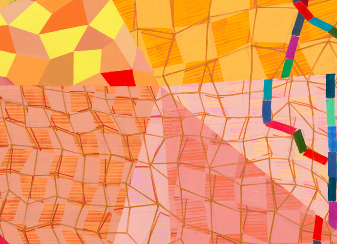
Rail: No. [Laughter] I mean, brutally honest, but pretty accurate. At this point, before we run out of time, we should go stand in front of your new pictures and talk about them. It seems to me that they fall into three groups. Categorical Contrivance (2025), the one we are now standing in front of, is the latest example of your destabilized grid. The rows of overlapping squares remind me—the way they get smaller as they approach the top of the canvas—of Piet Mondrian’s Pier and Ocean paintings of 1914. There’s also something remarkable going on with the colors here. There are these warm colors, like green, pink, and orange, which would clash violently if they weren’t desaturated. And then there are the curved shapes that encroach on the painting from the borders, painted with striated strokes of what I thought was teal, but you said that’s not right.
Davis: Phthalo blue. [Laughs]
Rail: Thank you. You introduced these biomorphic shapes and this kind of brushwork around 2007. How do they coexist with the geometric language of the pictorial field?
Davis: In every painting, I try to have geometry and biomorphism. Geometry, again, being measured, mathematical, and pragmatic in essence; and biomorphism being human in some way. I never know how they are going to coexist. Often—right now—they start with a very warm color that gets overlaid with other colors or glazes. I like to think of color as a muscle that moves and breathes, and warm undertones support that. It’s not rational, because you normally want geometry to stay still on the surface of the canvas. It’s like getting to know someone in a long conversation: forget the categories, you’re talking to someone. And what happens in any layer tells me what to do in the next layer. It is usually contrary to what occurred in the first layer. If something feels very geometric, I try to make it less so.
In Categorical Contrivance, there were taped green zones. That was a clear, objective move. But the layers on top are drawn freehand so they’re not perfect squares. They come in different colors. They start to overlap, which implies a kind of depth. And I mess with the modernist rationalization of color. There are these pink colors—anywhere from makeup to skin tones to darker pinks, which feel more plasticky, like the neon green versus the other, more natural green. I’m trying to vary the references among the plastic world, the mechanical world, the geometric world, the natural world. I’m also interested in how the edge of a canvas disrupts the composition. So, often, you’ll see shapes attached to the edge. Does that make the central grid figure or ground? Are the blue shapes figure or ground? And what do those shapes suggest? They might mean different things to different people.

Dogmatic Deceit, 2025, Oil on canvas, 80 x 60 inches.
Photo by JSP Art Photography, image courtesy of the artist
and Miles McEnery Gallery.
Rail: Let’s move on to Dogmatic Deceit (2025). It has the irregular net from your last show floating on top of a loose grid of squares. The lines of the net are red and pale green; the squares are translucent, lightly brushed shades of green. The picture is framed by an unfurling band of colored quadrangles painted in flat, opaque colors drawn from a different, cool palette. The painting feels very joyous in its energy and its colors, but it is literally framing a void. We’re looking at nothingness. What’s going on? [Laughter]
Davis: We were talking about the Eastern terminology of “substance and void.” Void is powerful. We, as Western people, are always interested in the substance—the facts we want to spew out, the categories we want to spew out—but there’s a lot of information in that empty space. I’m interested in framing emptiness so that you can fill it in more. But in Western culture, we have a hard time sitting with emptiness.
Rail: Aren’t there artists who’ve made a sense of emptiness part of their work? What about, say, Agnes Martin?
Davis: Yeah, but the structure of Agnes’s painting is still all-over. I’m framing the emptiness—maybe overdoing it. That kind of framing does not appear in Martin’s work.
Rail: “Framing the emptiness” makes me think of Jo Baer’s paintings from the sixties, the early ones that look like black painted frames. The centers are blank white, as if the real paintings were missing.
Davis: Maybe, psychologically, there’s a lot of void that people need to put stuff in.
Rail: Going back to what you were just saying about Eastern painting—I think you’re talking about the Chinese tradition of shan shui landscape painting: painting mountains and water. I’ve always been confused by that name, because, yes, you do see mountains and water, but what corresponds to what you’re describing is the mist—the fog that blows across the picture so that big chunks of landscape just disappear.
Davis: And they’re empty. When you’re looking at one of those paintings, you feel like you’re in that space with a huge scale, but it’s not all filled up. If you go to the Chinese galleries at the Metropolitan, that’s what you see. Very little marks, a lot of emptiness, and a real visceral understanding of place and scale. You cross the hall to go to the Japanese galleries, and you find a similar iconography, but it’s more pattern and decoration: flowers and mountains without use of the void. In my work, I’m interested in pattern and surface and decoration, but I’m also interested in the void.
Rail: In Chinese literati culture, the shan shui paintings correspond to the poetry. There’s a thousand years’ worth of beautiful poems about perceiving the universe, about the sense of immensity and emptiness.
Davis: That’s what I want.

Fleeting Form, 2025, Acrylic and oil on canvas, 80 x 60 inches.
Photo by JSP Art Photography, image courtesy of the artist
and Miles McEnery Gallery.
Rail: Here’s Fleeting Form (2025), which introduces a new compositional device: ovoid patches composed of concentric bands of pink and pale blue. The bands aren’t actually curved; they’re made from linear segments. But you put them together so they feel like curves. They appear and disappear between overlapping squares painted, in this case, magenta, tan, and orange. These squares here remind me of some of Mondrian’s paintings of 1917, but your squares are much more torqued away from the horizontal and vertical. Let’s go back to what you said about the grid as a symbol for fascist order.
Davis: [Laughs] You love that one.
Rail: I started studying Minimalism many years ago. It’s been grids all the way. [Laughter] Here’s my question: If the grid is a symbol for fascist order, how are we supposed to respond to these concentric bands? Is the viewer imprisoned within them, or is the viewer supposed to experience them as radiating outwards like Robert Delaunay’s discs?
Davis: Are you talking about the blue bands?
Rail: The blue bands and the pink ones that match them. They are very different from anything else I’ve seen in your pictures, and I’m trying to get a fix on the feeling they evoke.
Davis: I have a vocabulary that gets remixed in every painting. I never want one painting to look like the other. I’m always trying to expand that vocabulary. I have shifted the vocabulary to include these shapes, as you’ve said, with these bands across them. They’re gestures. They’ve been taken out of some order and reassembled on this surface.
Rail: If the rigid grid is a symbol for fascist order, how do you imagine the viewer responding to this order?
Davis: There is no order here. [Laughs]
Rail: But as soon as you make these concentric bands—which imply a center that’s surrounded, maybe imprisoned, by other things—you’ve created a feeling of order.
Davis: Right, I’m always interested in a feeling of order.
Rail: You’ve ruptured that, if only by cutting them apart, so one could always escape through the cutaway part. But it brings in this whole new issue about things contained within other things, because they are concentric.
Davis: What do you mean by “concentric”?
Rail: Well, let’s take the blue bands here, near the lower right-hand corner. They start by heading for the right edge of the canvas, then they tilt downwards, then they echo the corner of the canvas, then they turn back to the left. As the viewer moves left, each band is within the one to its right. They’re contained by it. They repeat the same shape at a smaller scale. And to me, they seem to imply a kind of a kind of target design.
Davis: I would say that the first thing someone would ask about this painting is, “How do these three bluish sections fit together? Or do they?”
Rail: I was wondering about that.
Davis: They are like puzzle pieces that make sense if you put them together. They also suggest an illusion of space, because the rectangles are behind them. Also, because of the angle of the lines, there’s a suggestion of perspective.
Rail: So the blue bands might be, not just concentric, but receding towards the hypothetical center?
Davis: Correct. That’s why I see them as way off from the operating systems of modernist painting. The same with the pink ones. Are they transparent? What are they doing? How are they operating there? Are they defining areas? Or are they light? What are they?
Rail: I think they’re Kenneth Noland’s chevron. [Laughter] You broke it out of jail.
Davis: I’m going to come to your office and take away all the books on modern art! [Laughter]
Rail: We’re not going to come to an exact meeting of minds on this. But again, that strange ambiguity—is it opening up, or is it closing in?
Davis: I always want to keep things open and not closing in.
Rail: To conclude: a question about working process. These paintings have complex forms, like nets, which are layered over overlapping squares, which are interrupted by complex, curved forms. How do you make them? You’ve said in interviews that they are spontaneous, that they evolve, that you just start painting and see what happens. I believe you. And yet, when I look at them, I think, “They’re so complicated! How could you possibly do this without planning? Surely, there’s a preliminary drawing somewhere?”
Davis: I usually—but not always—start with an overall color. Whatever I do—if it’s random squares—every next move is a contrarian move to what’s presented.
Rail: Let’s go back to where we started, to Categorical Contrivance. Can you walk me through the process, beginning to end?
Davis: I’ll try. I believe this painting started with that yellow color. It is gradated, so it’s darker at the top and lighter at the bottom. Already, by gradating it, I’m disorienting the plane. Again, part of me is interested in the ephemeral—the light in the work—as well as the practical—the geometry in the work. Then I put in those green squares. They were taped. Strategically, the big ones are at the bottom and the smaller ones are at the top. They’re painted with a very light glaze to keep some light and air in the work. Then, conversationally, I thought, “What’s the opposite of that? Well, no more tape. I’m going to get out a brush and I’m going to start painting squares, not aligning with what’s there. Showing the hand and the imperfection of measurement. A disruptor.”
Rail: So the pink squares come after the green ones?
Davis: Yes, and before the orange.
Rail: On the bottom edge of the picture, there’s a place where you see a green square, with what seems to be a pink square behind it, but that’s really bands of pink around two sides of the green square, creating an illusion of another square behind it.
Davis: Right.
Rail: Thank you!
Davis: At some point, all the squares were all submerged in this light and color and overlap, etc. So I decided to bring them forward. In this area, I used the same colors and brought them to the forefront.
Rail: That’s just above and to the right of center, where there is a group of flat, colored squares that don’t have a net or anything over them. Were they added after the other squares?
Davis: They were added after. And then I thought, “Well, what if the line were in there, but it’s not fully the square?” And that’s where those last blue lines came in. I don’t remember at what point the edge—the phthalo blue—occurred. I can’t really narrate what came first and second. It’s truly conversant, and they just keep going until they’re complicated enough and have the elements that I think are important in them that are loosely related to fact and fiction.
Rail: The biomorphic blue forms are visibly on top of everything else, and yet their color pushes them backwards, so that they seem like cutouts from the surface, rather than appliqués on top of it.
Davis: And color changes as I make them. Those blue shapes were originally another color.
Rail: One more question, about the very narrow blue and green lines. Here, they enclose the squares instead of joining up into a network, but it’s the same kind of line. How are those actually painted? Do you paint them along a straightedge?
Davis: No, no. Those are all freehand. When I use a ruler or tape, the line has a kind of factual believability. In contrast, there’s something subjective about these lines, because you can see my hand not making an exact, right-angled corner—not getting an even line. It’s subtle, but it’s important.
Rail: It’s very important, and I’m filled with envy. I’ve had shaky hands since I was a teenager. I could never draw such a straight line.
Davis: I’ll have you over to the studio, we’ll practice. [Laughter]
Rail: Thank you!
Davis: They’re not tight. They’re not neat paintings. I leave messes in them. I’m okay with them not being super-slick, super-crafted paintings, but really looking handmade.
Rail: A good note to end on. Thank you so much!
Pepe Karmel —
